5 techniques to make your logo Responsive
PART 2
Last week i showed you some examples from big brands and explained Why You Need a Responsive Logo. This week I’ll show you how a Responsive Logo can be achieved.
Keep in mind you’ll still need a graphic designer to do this for you but being prepared before your meeting could save you time and money.
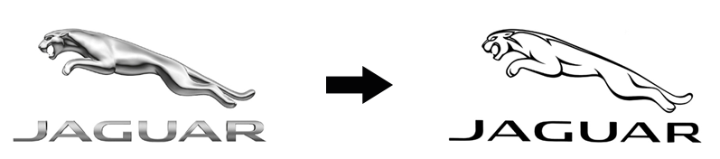
1. Simplify an Illustrated Logo
If you have a detailed illustration of a logo and need to use it as an embroidered logo on uniforms, or as a very small size while maintaining the most impact, then simplifying an illustration or complexity of the design is a great way. You can see with the well known Jaguar logo, that the impact of the illustration isn’t lost when it’s simplified. Both these logos can be used at different times and still be recognizable.
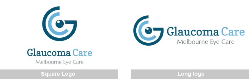
2. Vertical Stacking. A long and square version
Having both a long and square version of the logo is a simple way of being able to display your logo on different devices without losing any detail. In the example below, the square logo takes up less room, where the long logo will be better for website headers.
This is a great solution if your logo is mostly displayed on bigger devices.
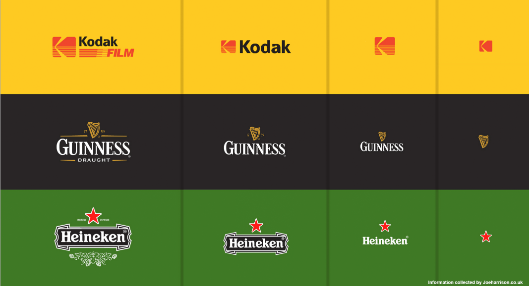
3. Incremental Reduction
The hardest part to simplifying a logo is to embody the brand’s values even with the simplest of elements. This treatment really works when logos are used on small devices or when not much space is available. The use of brand colours in this instance really helps with brand recognition too.
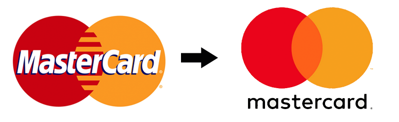
4. Text within a logo
The recently rebranded Mastercard logo is a good example of how the type now sits as a separate element to give the logo more flexibility and better use on digital media. They have moved the name to sit underneath the circles so it can be used independently from the type while still being recognisable. This makes the logo more versatile.
5. Reduce Detail within the logo
This illustration below is a great example of how a complex illustration can be simplified as screen sizes get smaller. By having a very simple icon as the logo gets smaller, it means that when the logo is viewed at a larger size, it has the capacity for more complex shapes.
Image from Joe Harrison's site

A ‘Responsive Logo’ is a relatively new term which some designers may not be familiar with. When speaking to a designer about your logo, make sure you tell them where your logo will be used in the long and short term, or ask them for a responsive logo, or better still talk to me.
To find out how your logo can be converted into a responsive logo, call 0422 908 396 or email melanie on mel@enganagraphics.com.au