Weskay Case Study
We were lucky enough to develop a whole new brand for Weskay. Weskay empowers leaders by supporting and guiding them to inspire and influence their own teams. And our job was to present Weskay in a way that elicits a sense of trust and professionalism while being modern and approachable.
Their previous brand image was very dull and outdated giving the wrong message about the company. And with that, I knew we were able to do something great!

With the expertise of Judy from Maxim Marketing, who wrote the design brief, liaised with the client, wrote the copy and did the website strategy, we decided this was the way to approach this project: By using clear clean lines, simple design elements, a smart vibrant and trusting colour palette, a clean & easy to read font, a smart website design, modern and approachable. Not to mention good copy and images that portray a new way of thinking.
![]()
Judy and I were able to narrow down the designs between us before showing the client. This meant a quick refining process between her and I with minimal revisions once we showed the client.
![]()
The client loved what we presented and was right on the mark. And the following design was the winner.
![]()
Once the logo was designed, my job had only just started. Next was stationery, brochure and website.
All of these elements together create the visual brand.

For the business card I used the arrow from the logo as a visual hook that can be carried across all the marketing material.

Again using the arrow and also creating another design element from the arrow to add interest and balance out the page reinforcing the colours.

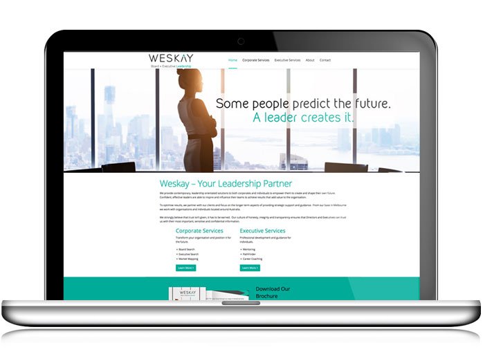
The website also uses these design elements along with other images that tie in nicely to the whole style. The font was carefully chosen to work with the brand font while also being a web safe font. We wanted to use clear & powerful headlines with bold statements and large headings to separate the text.
Branding for a company that mentors and encourages leaders, it was important to portray honesty, integrity and transparency through their visual communication. And i think by using clear simple strong shapes and colours we achieved that beautifully.
The process was very smooth (which always is working with Judy from Maxim Marketing). The project was delivered on time and on point. Another job well done !