Why You Need a Responsive Logo
PART 1
It’s true that most designers swear by the phrase ‘Less is More’. I’ve had people roll their eyes at this phrase as it’s often the opposite of what they think they need for their brand.
What used to be a designer's personal preference, is now becoming a necessity for most businesses. And it’s not just a passing ‘trend’.
Due to the rise of flexible screen sizes, tablets, phones and devices, ‘Less is More’ is a necessity and you’ll see below how some of the big companies are taking this approach and stripping back their logos to give them way more flexibility.
But before i show you some examples, first let me explain what this all means.
So what are Responsive/Flexible Logo’s ?
We’ve heard about Responsive Websites and how layouts shuffle around to suit different screen sizes and devices. For a Responsive Logo, it’s the elements of the logo that shuffle around, are simplified, minimised and adjustable.
Why?
Responsive Logos are the epitome of flexibility. But the main reason this is done, is to ensure your logo maintains it’s impact given the tiny size it’s being viewed on.
By having a responsive logo, you’ll give your brand the best chance to be remembered and recognized over the many different sized devices people use these days.
How it used to be
It used to be that logos were created simply for shop windows, local papers, stationery, and static websites. A consistently represented logo across all these platforms were the key to your brand being recognised and remembered.
And now...
These days, it’s almost necessary to have a responsive and flexible logo, which means having different versions of the same logo to use across different sized devices and mediums.
Here are some examples of some recent rebrands where they have simplified, modernised, and reduced detail in their logos to make them flexible and responsive.
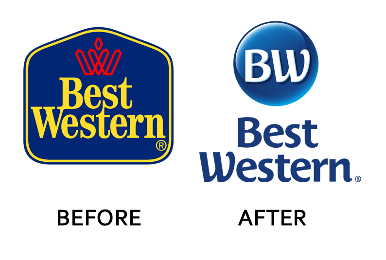
Best Western: They have removed the words from the constricted shape, separated their design element and removed the more complex ‘W’ from the brand altogether.
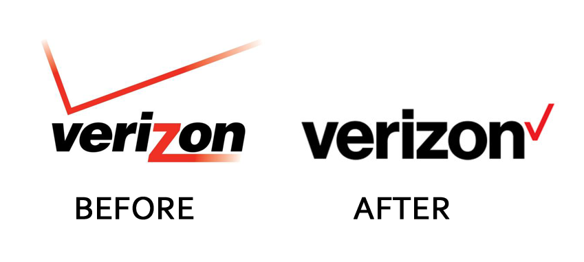
Verizon: The tick above the logo would limit the impact of the logo at small sizes. The gradient fading within the tick and z would also limit how it could be used over different backgrounds.
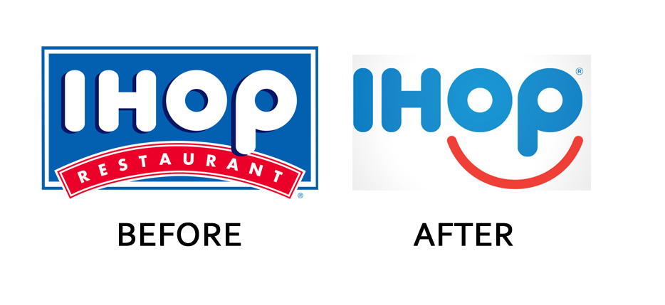
IHop: They have separated the background element and given it a separate graphic device (the red smile)
Logo examples taken from www.businessinsider.com
The design of a responsive logo should be considered at the start of any design project, but if you already have a logo, and want to know how to make your logo responsive, read our next blog 5 techniques to make your logo responsive.
If you just can’t wait until next week for Part 2 of this post, (I know, you’re all hanging on the edge of your seat), email or call me on 0422 908 396 and let's talk about how we can adjust YOUR logo to make it responsive.